


Introduction
One of the important factors that determine the success of a product, be it software or a physical accessory, is user reach and user engagement. And to achieve that the product should be inclusively designed for all kinds of users.
The designers, during its inception phase, must step away from preconceived notions of what a “typical” user is, and instead, look at people as unique, diverse individuals who have differing abilities at different times in their lives, based on their particular circumstances and environment.
This can generally be achieved by two types of approaches: accessible design and inclusive design. This topic mainly talks about accessible design.
What is Accessibility?
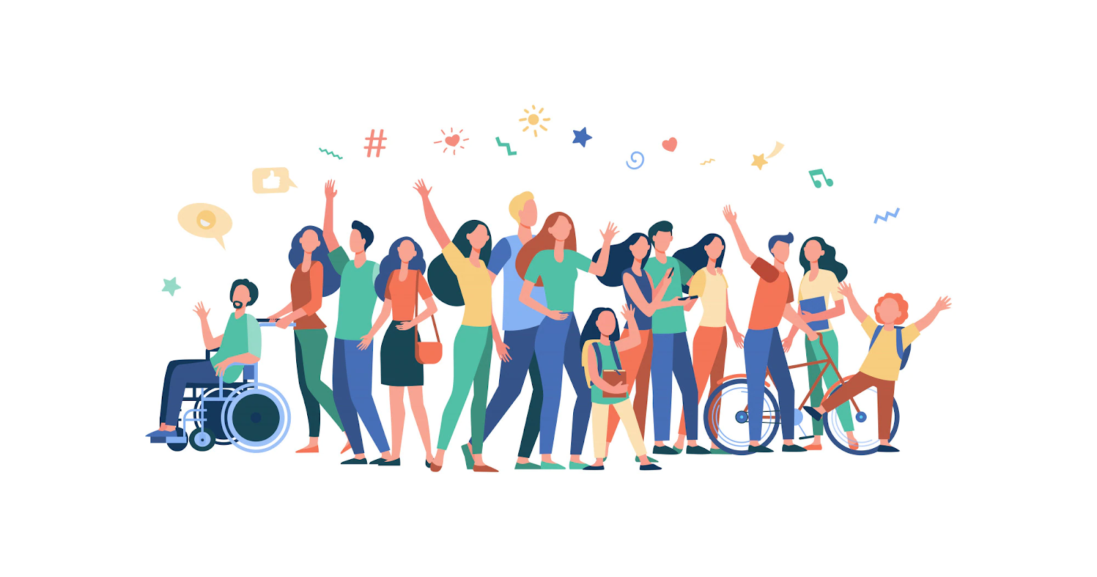
The term "accessibility" refers to whether a product or service can be used equally by ALL users. Accessibility is governed by laws that ensure that people with disabilities have equal access to goods and services. Designers must strive to be as inclusive as possible, creating designs that work well for as many users as possible.
In the context of design, accessibility refers to the number of people who can use a certain interface. This typically entails designing for persons with a variety of disabilities, including vision, hearing, mobility, cognitive, and so on.
Innovation is not hampered by accessibility. Accessibility will not force you to create an ugly, boring, or cluttered product. It will present you with a set of constraints to consider as you design. These design constraints will provide you with new ideas to pursue, resulting in making great products for all of your users.
Why Accessibility in UX is Important?
Improving the accessibility of your product can improve its usability for all users, including those with low vision, blindness, hearing impairments, cognitive impairments, motor impairments, or situational disabilities.
Accessible design can also help in creating:
1. Better SEO Rankings

2. Greater Audience
Creating a product with accessibility in mind means reaching a larger audience. According to a WHO report, if accessibility design is not considered, 15% of the world's population will be excluded from a product or service.
3. Public Relations

Designing for all users is a wonderful strategy to boost a company's inclusive reputation. It's also a hot topic in the world of public relations for brands.
How to create an accessible design?
How do we design UX that incorporates accessibility as an integral element of the overall experience, rather than as an afterthought? In its Web Content Accessibility Guidelines (WCAG), the World Wide Web Consortium (W3C) lays out criteria for accessible design. The following suggestions will assist users with a wide range of disabilities, although they are not exhaustive.
1. Navigation by landmark
When page landmarks, such as headings, contain the appropriate semantic markup, some assistive devices allow users to navigate between them.
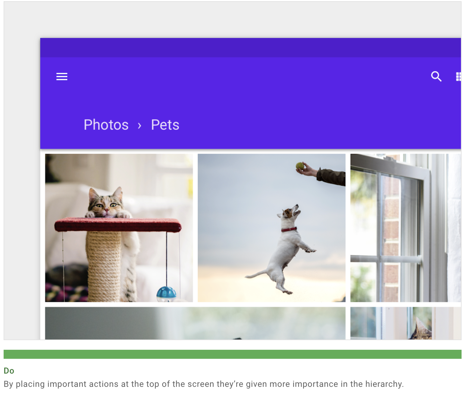
2. Hierarchy
Multiple visual and textual clues, such as colour, shape, text, and motion, help to emphasise which information is significant.
You can simplify how your UI is understood by using:
- Clearly visible elements
- Sufficient contrast and size
- A clear hierarchy of importance
- Key information that is discernable at a glance
3. Feedback
Touch feedback and visual feedback (such as labels, colours, and icons) show users what is available in the UI.
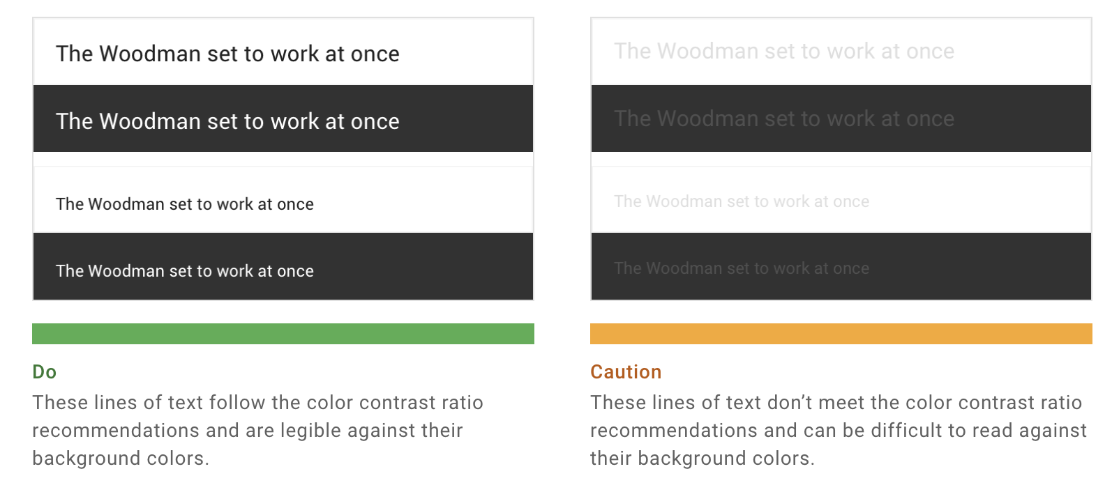
4. Colour
Color and contrast can be applied to aid users in seeing and understanding your app's content, interacting with the correct sections, and comprehending actions. Users with low vision will be able to view and use your application if there is enough colour contrast between items.
5. Contrast Ratio
According to the World Wide Web Consortium (W3C), the contrast ratio between a colour and its background ranges from 1 to 21 based on its luminance (the intensity of light emitted).
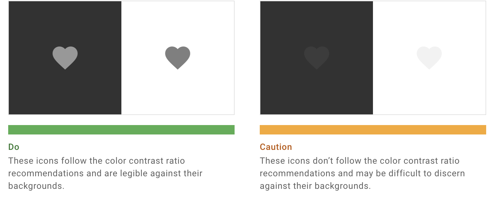
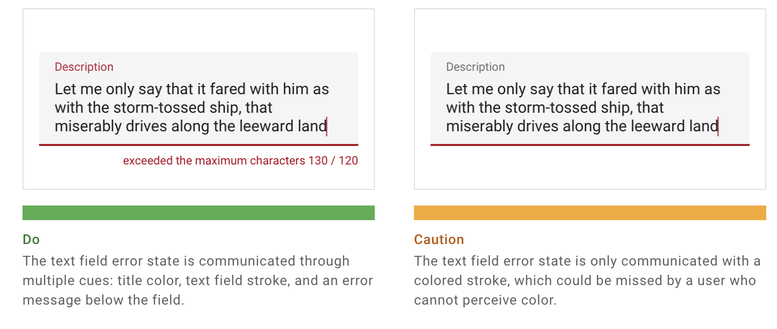
6. Other visual cues
Multiple visual cues help communicate crucial states because colorblindness comes in several forms (including red-green, blue-yellow, and monochromatic). Strokes, indications, patterns, textures, and text can all be used to describe actions and content.
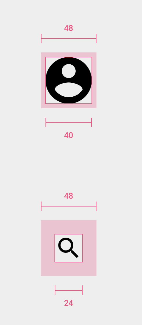
7. Touch targets
Consider making touch targets at least 48 x 48 dp for most platforms. Regardless of screen size, a touch target of this size has a physical size of around 9mm. To allow a wider range of users, larger touch targets may be appropriate.
8. Touch target spacing
Touch targets separated by at least 8dp of space ensure balanced information density and usability in the majority of circumstances.
9. Alternative text (Alt text)
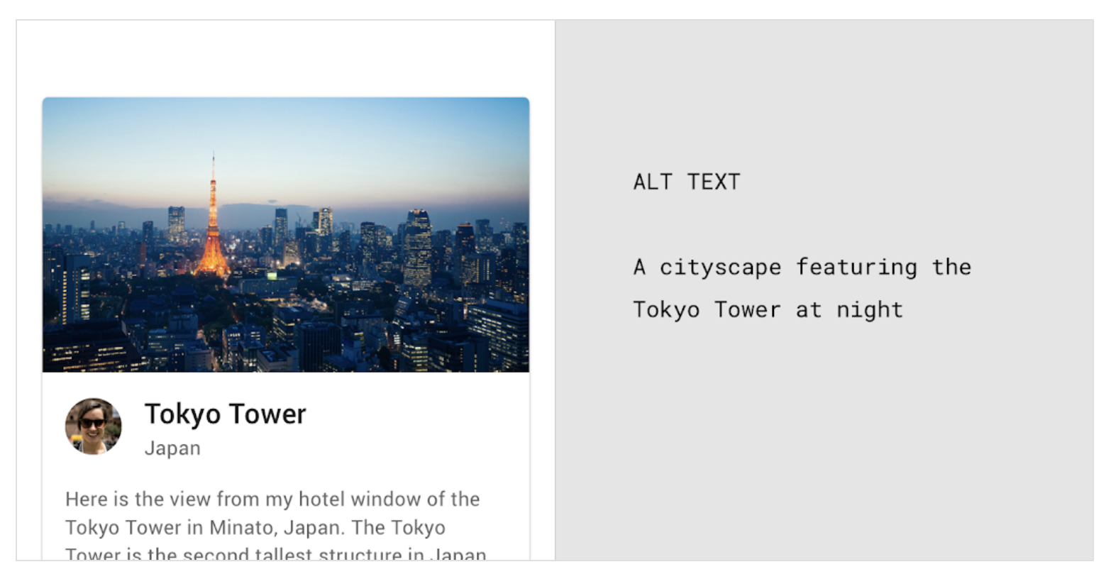
Alt text aids in the translation of a visual interface to a text-based user interface. For viewers who are unable to see images, alt text is a small description (up to 125 characters) in the code that explains the image.
Conclusion
There are numerous challenges in the process of product design while designing for accessibility, and empathy is the only true tool for finding solutions. Understand people's needs as much as possible. Make an effort to be open to worlds other than your own. It will not only make your product more accessible but also more human.